The Graphic Reporter

Thursday, December 20, 2007 0 comments

A note from Lesa Snider King, The Graphic Reporter

The Graphic Reporter, your source for tips, tutorials, and reviews for all levels of creative enthusiasts. You'll find detailed, easy-to-follow step by step tutorials on software like Adobe Photoshop, Illustrator, InDesign, GoLive, the Mac OS, just to name a few. Peruse web design techniques, marketing ideas, site visiblity tricks, digital photography, software reviews, and much more. Join me each week as I upload new Tutorials & QuickTips, the latter being just that—very quick, time-saving tricks and keyboard shortcuts. Not only will I be writing QuickTips myself, but I invite you to submit your own as well.

So come and join me on an exploration of being digitally creative, learn time-saving tips, and be my virtual travel companion on the road. I hope you visit often!

The Graphic Reporter

The Contact Sheet tip of the week

0 comments
By Lesa Snider King:
Resizing Without Quality Loss

Photo resolution is probably one of the most misunderstood aspects of digital image editing. The truth is, image resolution matters only if you're going to print the image. If the image is destined to live onscreen, it's the pixel dimensions that matter. Pixel widths and heights can be measured at any resolution. However, you have to be careful how you change it. Pop open the Image Size dialog in Photoshop and uncheck the Resample Image checkbox at the bottom left. This locks the pixel data, locking in quality. It’s confusing because the onscreen image won’t change a bit; the truth can be only revealed by the Image Size dialogue box.

Lesa Snider King, The Graphic Reporter, is iStockphoto's Chief Evangelist.

Before & After Magazine

Friday, December 14, 2007 0 comments

Who we are
Before & After magazine has been sharing its practical approach to graphic design since 1990. Because our modern world has made designers of us all (ready or not), Before & After is dedicated to making graphic design understandable, useful and even fun for everyone.

0363 | Design a logo of letters
Are you known by your initials? Turn those letters into a terrific signature! 28 pages, 2.6MB | Free Download

The Contact Sheet tip of the week

Friday, December 7, 2007 0 comments
By Lesa Snider King:
Auto align saves time

Did you know Photoshop has alignment tools? The only problem is that you may never see them. They live in the options bar at the top of the screen but they only appear when you have the Move tool selected, and more than one layer highlighted. So the next time you find yourself going blind by trying to align things by sight or by dragging placing guides, reach for the alignment buttons instead. It can be a huge production time-save

Lesa Snider King, The Graphic Reporter, is iStockphoto's Chief Evangelist.

Color

Thursday, December 6, 2007 0 comments

You've finished your image and everything should look perfect: you've got lots of detail, you've put a lot of thought into the overall placement of each element, and you've got a great concept. But something's not working.

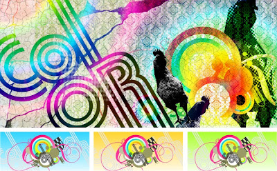
If you're not paying attention to the color in your image, you're missing one of the single most important visual elements at your disposal. Color does it all: inspires emotions, punches out elements and draws the eye, heats up or tones down a mood. Color creates drama, depth, and volume. On the flip side, though, using the wrong color can easily ruin what otherwise would have been a great composition. Don't settle for the colors the world dishes up. Choose your hues, organize your tints, and take control of your palette.See, different surfaces reflect or absorb different parts of the visible light spectrum. Your eye, little marvel that it is, sorts the light out and gives you the color. "What is red?" is a question for philosophy students and stoners. What matters to us is that all colors evoke different moods, feelings, and reactions in people, and if we can control the color in an image, we can influence how people react to it.

click here for Full Article.

Vector Do's & Don'ts VI

0 comments
Gradients

We see this time and time again: new vector illustrators who are smitten with gradient effects. We’ve never been able to figure out why this is (though we’ll all admit, under pressure, that we were the same way when we first started illustrating).

Gradients can add instant depth and volume to a shape with the click of a button and make surfaces gleam. However, it takes a good understanding of how light works to turn a gradient into the powerful tool it can be in the right hands.

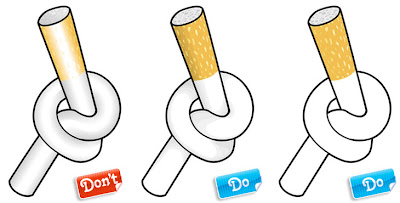
Example 1 is a simple file, which would work very well as line art or with some simple shading. But wait: let’s try to make it look nice and rounded with some neat-o gradients! Ouch. Wrong. The gradients here are way too harsh. Creating a gradient that transitions from a solid color all the way to white or black usually ends up looking pretty nasty. That cigarette filter looks horrible with that amount of contrast between the opposite ends of the gradient… After all, filters are made of colored paper, not chrome! The gradients are better on the white part of the cigarette because the contrast isn't as dramatic, but still they really aren't suited to the style of this illustration with its thick heavy outline. Besides, the surgeon general says smoking's bad for you.

We've kept the outlines the same in Examples 2 and 3, all we've changed is the interior coloring technique. The example on the far right is simple flat color, which is clean, bold and simple. The middle example uses a little shading to show a bit of depth, but it's nice and subtle and doesn't interfere with the style of the illustration. I'm still not saying you should light up but this cigarette would clearly be much easier on the eyes/lungs.
click here for Full Article.

Vector Do's & Don'ts V

0 comments
Style (Bortonia)

There are lots of stylistic techniques you can use to add oomph to a vector and give an illustration your own personal flair. Color combinations, line weights, graphic simplification, shading and highlights, and texture can all be manipulated to create different looks and feels. The trick is to pick a style and stick with it: mixing and matching styles can get distracting quick unless handled by an experienced professional.

Each of the characters in Example 1 are great. The problem is they have nothing to do with each other, stylistically. We have the simplified cartoony ladies in the back, a comic-style outlined girl in striped socks, a realistic business man, and then a more detailed cartoony woman in the foreground. The overall effect is weird, disjointed, and distracting. While it’s tempting to reuse elements from existing vector files in a new composition you still need to ensure everything matches in the end.

In Example 2, all of the characters are drawn in the same style: simplified, geometric, and angular. The colors are all flat with no gradients or detailed shading, and the color palette plays on a warm/cool complimentary color scheme (red and green). Nothing jumps out as being out of place or at the wrong party.click here for Full Article.

Vector Do's & Don'ts IV

0 comments
Proportion (Jayesh)

Stylization and exaggeration of the human figure is way cool and we encourage it, however you still need to keep in mind where exaggeration works and where it doesn’t. Just remember that when stylizing you should still be paying attention to the basic rules of proportion.

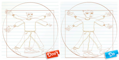
We’ve used the classic ‘proportions of man’ to demonstrate. Example 1, on the left, shows a myriad of proportional mistakes. The head is too small, the arms are all different lengths, the hands and feet vary in size from honkin’ huge to miniscule, and the legs are too short. This is one weird looking dude, and it’s clearly not because of artistic license.

The man in Example 2, while highly stylized, follows an actual human’s proportions much more closely. The limbs are all the correct lengths and the hands are the right size (remember, a human hand is approximately the same size as a face). Here’s a great example of how to create a distinctive style and feel while maintaining an accurate human proportion.click here for Full Article.

Vector Do's & Don'ts III

0 comments
Cropping and Alignment (Jayesh)

There are countless ways to organize vector elements on an artboard. That’s one of the best things about vectors: It’s easy to break them apart and tinker with individual shapes, without the loss of image quality you often see when editing a raster file. That said, vectors can easily suffer from poor decisions when it comes to composition and cropping.

The elements in Example 1 have been aligned to the vertical or horizontal edges of each other. This creates awkwardly tight eye movements for the viewers, and makes things appear cut off.

Negative space is wonderful when used effectively. On the other hand, abandoning large areas of real estate within an illustration, or chopping off shapes without forethought, just shows poor planning, like in Example 2.

Clumping everything into the centre in Example 3 not only creates a rushed and unplanned composition, it is just bad feng shui.click here for Full Article.

Vector Do's & Don'ts II

0 comments
Linework (72ppi)

Illustrator offers a few ‘default’ options for outlines. You get your simple, mechanical-styled strokes in whatever point size you choose. You also get nifty strokes that look like paint, or chalk; oooh, aah! Unfortunately, many designers have seen these default stroke effects used, over and over again. To stand out from the crowd you’ll need to take things to the next level.

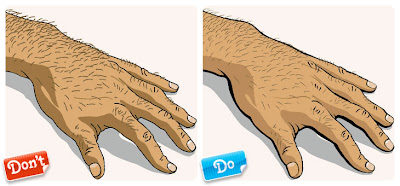
We’ll admit, Example 1 isn’t a bad illustration at all. The proportions are good, the details are relatively clean and there’s some nice color happening. But it could have been a heck of a lot more interesting! You’ll notice all of the lines, while cleanly executed, are the plain ol’ boring 1 point default stroke ending in your typical, bland rounded ends. Every line in the file is the exact same weight. While using default stroke weights can work very nicely on subjects like diagrams and mechanical drawings, it’s not working so well on this hand. Even on mechanical and technical drawings you should still be customizing your stroke weights, or using several different weights to help differentiate between specific sections within the drawing. The line work here lacks both style and personality.

Example 2 is far more exciting. We’ve used what’s called ‘variable’ line weights, meaning the strokes travel from thick to thin. Variable lines are much more natural looking: Even though real-life objects don’t have outlines around them, if they did, we bet they’d be variable and not a consistent 1 point black stroke. Variable lines can be created by outlining your strokes and then playing around with the edges; you can create your own brushes to do the work for you. Working with variable lines can be daunting at first but it’ll elevate your illustrations from amateur to pro.


click here for Full Article.

Vector Do's & Don'ts

0 comments
It's All About The Details (Bortonia)

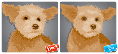
Once upon a time vector files had a teeny tiny 270 pixel preview thumbnail, with no zoom feature. Happily those days are long gone and all new vector uploads boast the same zoomable preview image as their photo counterparts. Unfortunately this also means that your vectors are going to be scrutinized closer than ever before. That’s why it’s important to take a close look at your illustration before you submit.

Are the curves in your shape curvy, or choppy? Do your shapes meet up cleanly at the edges, or are there small gaps where you rushed while drawing? Sometimes a file will look fine from the preview but once it’s opened into vector editing software it suddenly won’t be as pretty. And yes, customers do notice rushed details.

Example 1 looks pretty nice from the thumbnail (what an adorable dog!), but zoom in a little and you’ll see all sorts of problems. The fur is rumpled like someone didn’t read the ‘dry clean only’ tag, and shapes are crossing over themselves left and right. Crossed shapes, while not a technical issue per say, tend to scream “rushed!” and “I haven’t learned to use the pen tool properly yet”! Fur shouldn’t look this gloppy, bedraggled and messy!

Example 2 is much, much cleaner up close. The fur is smooth and each hair ends in a tidy point. The eyes are perfectly round now and it’s easier to see the dog’s cute little mustache, since all the sloppiness of the first Example has been cleaned up. You might want to pass on petting the first dog, it looks like it may have fleas. Puppy number 2 is ready for adoption.
click here for Full Article.

Momma Can't Help You Now:

0 comments
A Crash Course in Organization for Designers

As a child, I was constantly trying to find new and innovative ways of avoiding chores. Cleaning my room was by far the worst--operating under the motto "Out of Sight, Out of Mind," I would use a single ploughing motion to bury my stuff far under my bed. The advantages of my system were immediate but fleeting. And it always left me sorting through a mess of my own making.

In my design career, it soon became clear that my personal housekeeping techniques just wouldn't do. The lack of organization in my computer workspace caused me great stress. Thankfully, with some persistence, I eventually organized my digital work environment and, in so doing, exponentially increased my productivity. I no longer spend time needlessly scouring a disorganized database to find a single file. This makes for faster project turnovers and more deadlines met.

If you think your personal organization is just your problem, consider this: your project may eventually pass into other designers or developers who will use the files for their own purposes. Passing off a mess of files to them will cause them undue frustration and may even spoil your chances of landing future projects. In my own career, I've learned the hard way that the benefits of organization can't be overstated. And so I have reformed. Here are a few of my personal tips for those of you looking to turn over a new (and I hope orderly) leaf.

click here for Full Article.

Branding Builds Character

0 comments
by Sheree Clark

Spuds MacKenzie, Mr. Whipple, Joe Isuzu, the California Raisins … the list of images, people or creatures that have been used successfully in advertising is a long one. We love them (or love to hate them), we mimic them, but most of all, we believe them—or we wouldn’t buy their wares. Certain characters—the ones we remember from childhood—have a way of defining the era we grew up in, just as our remembrance of them reveals our age. While Baby Boomers will likely recall the Ajax White Knight, Speedy Alka-Seltzer and Mr. ZIP, their offspring grew up with ties to Frank Bartles and Ed Jaymes, McGruff the Crime Dog and Vince and Larry (the crash-test dummies).

Lots of emotions and memories are wrapped up around a large pool of product-hawking personas. But there is an elite tier of personage—the platinum members of the brand character crowd—that have outlived, outranked and outsold even the luggage-mauling American Tourister gorilla. These are the notable mascots, characters and icons that have, in some way, become the brand itself. Their personalities are memorable, effective and timeless, and numbering in their ranks are the likes of Aunt Jemima, the Pillsbury Doughboy, Elsie the Cow, the Morton Salt Girl and others.

WHAT MAKES THEM WORK?
While characters whose vocations revolve around pushing cigarettes or liquor are different animals from those endorsing breakfast cereal, some common denominators exist among the longest-lived brand personas. Although your next project may not be for a major player like the examples cited here, just thinking about your own experiences with brand mascots puts you in a better position to make good recommendations. So, let’s take a trip down Memory Lane and review what exact factors have made certain brand personalities last so long.

Click here for Full Article.

Ye Olde Sketchbook

0 comments
By Angela Cho, Graphic Designer, Shutterstock

Many years ago I was preparing for an interview with a well-known graphic design studio. I spent weeks polishing up my resume and perfecting my book. When I got to the studio, the first thing they asked me for was my sketchbook. The question caught me off guard; I was speechless. Once I revealed that I did not, in fact, own a sketchbook, the interview ended there. Although I left without the coveted internship position, I did take away a valuable lesson: the importance of having a sketchbook.

What is a sketchbook? A humble notebook, it is a receptacle for visual and conceptual representations of thoughts and ideas. It is also one of the easiest things to keep because all you really need to have is a pencil, paper and your imagination. You don't even need to be a particularly skilled artist to use one; it is purely a forum in which you can freely express your creativity and further develop your ideas. Best of all, a sketchbook has a profound effect on your creative process. So why do so many designers, my younger self included, underestimate the value of this simple tool?

Designers, like writers and artists, are constantly finding inspiration in their surroundings. Often ideas are fleeting--they can be gone almost before you register them, so if you don't scribble them down, it's as if they never happened. A sketchbook acts as a mental butterfly net and a physical archive of all of those random thoughts, quirky sightings and everyday experiences that can add up to an inspired idea.
click here for Full Article.

Mac OS X keyboard shortcuts

Monday, December 3, 2007 0 comments
Startup
• Press X during startup (Force Mac OS X startup)
• Press Option-Command-Shift-Delete during startup
(Bypass primary startup volume and seek a different startup volume (such as a CD or external disk))
• Press C during startup (Start up from a CD that has a system folder)
• Press N during startup (Attempt to start up from a compatible network server (NetBoot))
• Press T during startup (Start up in FireWire Target Disk mode)
• Press Shift during startup (start up in Safe Boot mode and temporarily disable login items and non-essential kernel extension files (Mac OS X 10.2 and later))
• Press Command-V during startup (Start up in Verbose mode.)
• Press Command-S during startup (Start up in Single-User mode)

Finder window

• Command-W (Close Window)
• Option-Command-W (Close all Windows)
• Command-Right Arrow (Expand folder (list view))
• Option-Command-Right Arrow (Expand folder and nested subfolders (list view))
• Command-Left Arrow (Collapse Folder (list view))
• Option-Command-Up Arrow (Open parent folder and close current window)
• Assigned in Keyboard & Mouse preferences (Show Package Contents (of selected file in Mac OS X 10.5 or later only). To create this contextual menu shortcut, open Keyboard & Mouse preferences in Mac OS X 10.5, click Keyboard Shortcuts, click the "+" button, choose Finder.app as the Application, and type "Show Package Contents" (exactly), and set whichever shortcut you want, such as Command-Control-S.)

Menu commands

• Shift-Command-Q (Apple Menu Log out)
• Shift-Option-Command-Q (Apple Menu Log out immediately)
• Shift-Command-Delete (Finder Menu Empty Trash)
• Option-Shift-Command-Delete (Finder Men Empty Trash without dialog)
• Command-H (Finder Menu Hide Finder)
• Option-Command-H (Finder Menu Hide Others)
• Command-N (File Menu New Finder window)
• Shift-Command-N (File Menu New Folder)
• Command-O (File Menu Open)
• Command-S (File Menu Save)
• Shift-Command-S (File Menu Save as)
• Command-P (File Menu Print)
• Command-W (File Menu Close Window)
• Option-Command-W (File Menu Close all Windows)
• Command-I (File Menu Get Info)
• Option-Command-I (File Menu Show Attributes Inspector)
• Command-D (File Menu Duplicate)
• Command-L (File Menu Make Alias)
• Command-R (File Menu Show original)
• Command-T (File Menu Add to Favorites (Mac OS X 10.2.8 or earlier), Add to Sidebar (Mac OS X 10.3 or later—use Shift-Command-T for Add to Favorites))
• Command-Delete (File Menu Move to Trash)
• Command-E (File Menu Eject)
• Command-F (File Menu Find)
• Command-Z (Edit Menu Undo)
• Command-X (Edit Menu Cut)
• Command-C (Edit Menu Copy)
• Command-V (Edit Menu Paste)
• Command-A (Edit Menu Select All)
• Command-1 (View Menu View as Icons)
• Command-2 (View Menu View as List)
• Command-3 (View Menu View as Columns)
• Command-B (View Menu Hide Toolbar)
• Command-J (View Menu Show View Options)
• Command - [ (Go Menu Back)
• Command - ] (Go Menu Forward)
• Shift-Command-C (Go Menu Computer)
• Shift-Command-H (Go Menu Home)
• Shift-Command-I (Go Menu iDisk)
• Shift-Command-A (Go Menu Applications)
• Shift-Command-F (Go Menu Favorites)
• Shift-Command-G (Go Menu Goto Folder)
• Command-K (Go Menu Connect to Server)
• Command-M (Window Menu Minimize Window)
• Option-Command-M (Window Menu Minimize All Windows)
• Command-? (Help Menu Open Mac Help)
• Command-Space (Open Spotlight (Mac OS X 10.4 or later))
• Command-esc (Front Row Activates Front Row for certain Apple computers)

Other Commands

• Option-Command-D (Show/Hide Dock)
• Command-Tab (Switch application)
• Tab (Highlight next item)
• Command-Up Arrow (Move up one directory)
• Command-Down Arrow (Move down one directory)
• Page Up or Control-Up Arrow (Move up one page)
• Page Down or Control-Down Arrow (Move down one page)
• Option-Drag (Copy to new location)
• Option-Command-Drag (Make alias in new location)
• Command-Drag (Move to new location without copying)
• Shift-Command-C (Show Colors palette in application)
• Command-T (Show Font palette in application)
• Command-Shift-3 (Take a picture of the screen)
• Command-Shift-4 (Take a picture of the selection)
• Command-Shift-4, then press Control while selecting (Take a picture of the screen, place in Clipboard)
• Command-Shift-4, then Spacebar (Take a picture of the selected window)
• Option-Command-esc (Force Quit)
• Control-Eject (Restart, Sleep, Shutdown dialog box)
• Control-Command-Eject (Quit all applications and restart)
• Option-Command-Eject or Option-Command-Power .(Sleep)
• Command-click window toolbar button (upper right corner) (Cycle through available views for the window's toolbar (dependant on the nature of the Finder or application window))
• Command-` (Cycle through windows in application or Finder (if more than one window is open))
• Function-Delete (portables only--PowerBook, iBook, MacBook, MacBook Pro) (Forward Delete (delete the character to the right of your cursor))

Source: http://docs.info.apple.com/article.html?artnum=75459

Keyboard shortcuts for Windows XP

0 comments
General keyboard shortcuts
• CTRL+C (Copy)
• CTRL+X (Cut)
• CTRL+V (Paste)
• CTRL+Z (Undo)
• DELETE (Delete)
• SHIFT+DELETE (Delete the selected item permanently without placing the item in the Recycle Bin)
• CTRL while dragging an item (Copy the selected item)
• CTRL+SHIFT while dragging an item (Create a shortcut to the selected item)
• F2 key (Rename the selected item)
• CTRL+RIGHT ARROW (Move the insertion point to the beginning of the next word)
• CTRL+LEFT ARROW (Move the insertion point to the beginning of the previous word)
• CTRL+DOWN ARROW (Move the insertion point to the beginning of the next paragraph)
• CTRL+UP ARROW (Move the insertion point to the beginning of the previous paragraph)
• CTRL+SHIFT with any of the arrow keys (Highlight a block of text)
• SHIFT with any of the arrow keys (Select more than one item in a window or on the desktop, or select text in a document)
• CTRL+A (Select all)
• F3 key (Search for a file or a folder)
• ALT+ENTER (View the properties for the selected item)
• ALT+F4 (Close the active item, or quit the active program)
• ALT+ENTER (Display the properties of the selected object)
• ALT+SPACEBAR (Open the shortcut menu for the active window)
• CTRL+F4 (Close the active document in programs that enable you to have multiple documents open simultaneously)
• ALT+TAB (Switch between the open items)
• ALT+ESC (Cycle through items in the order that they had been opened)
• F6 key (Cycle through the screen elements in a window or on the desktop)
• F4 key (Display the Address bar list in My Computer or Windows Explorer)
• SHIFT+F10 (Display the shortcut menu for the selected item)
• ALT+SPACEBAR (Display the System menu for the active window)
• CTRL+ESC (Display the Start menu)
• ALT+Underlined letter in a menu name (Display the corresponding menu)
• Underlined letter in a command name on an open menu (Perform the corresponding command)
• F10 key (Activate the menu bar in the active program)
• RIGHT ARROW (Open the next menu to the right, or open a submenu)
• LEFT ARROW (Open the next menu to the left, or close a submenu)
• F5 key (Update the active window)
• BACKSPACE (View the folder one level up in My Computer or Windows Explorer)
• ESC (Cancel the current task)
• SHIFT when you insert a CD-ROM into the CD-ROM drive (Prevent the CD-ROM from automatically playing)
• CTRL+SHIFT+ESC (Open Task Manager)

Dialog box keyboard shortcuts
If you press SHIFT+F8 in extended selection list boxes, you enable extended selection mode. In this mode, you can use an arrow key to move a cursor without changing the selection. You can press CTRL+SPACEBAR or SHIFT+SPACEBAR to adjust the selection. To cancel extended selection mode, press SHIFT+F8 again. Extended selection mode cancels itself when you move the focus to another control.
• CTRL+TAB (Move forward through the tabs)
• CTRL+SHIFT+TAB (Move backward through the tabs)
• TAB (Move forward through the options)
• SHIFT+TAB (Move backward through the options)
• ALT+Underlined letter (Perform the corresponding command or select the corresponding option)
• ENTER (Perform the command for the active option or button)
• SPACEBAR (Select or clear the check box if the active option is a check box)
• Arrow keys (Select a button if the active option is a group of option buttons)
• F1 key (Display Help)
• F4 key (Display the items in the active list)
• BACKSPACE (Open a folder one level up if a folder is selected in the Save As or Open dialog box)

Microsoft natural keyboard shortcuts
• Windows Logo (Display or hide the Start menu)
• Windows Logo+BREAK (Display the System Properties dialog box)
• Windows Logo+D (Display the desktop)
• Windows Logo+M (Minimize all of the windows)
• Windows Logo+SHIFT+M (Restore the minimized windows)
• Windows Logo+E (Open My Computer)
• Windows Logo+F (Search for a file or a folder)
• CTRL+Windows Logo+F (Search for computers)
• Windows Logo+F1 (Display Windows Help)
• Windows Logo+ L (Lock the keyboard)
• Windows Logo+R (Open the Run dialog box)
• Windows Logo+U (Open Utility Manager)

Accessibility keyboard shortcuts
• Right SHIFT for eight seconds (Switch FilterKeys either on or off)
• Left ALT+left SHIFT+PRINT SCREEN (Switch High Contrast either on or off)
• Left ALT+left SHIFT+NUM LOCK (Switch the MouseKeys either on or off)
• SHIFT five times (Switch the StickyKeys either on or off)
• NUM LOCK for five seconds (Switch the ToggleKeys either on or off)
• Windows Logo +U (Open Utility Manager)

Windows Explorer keyboard shortcuts
• END (Display the bottom of the active window)
• HOME (Display the top of the active window)
• NUM LOCK+Asterisk sign (*) (Display all of the subfolders that are under the selected folder)
• NUM LOCK+Plus sign (+) (Display the contents of the selected folder)
• NUM LOCK+Minus sign (-) (Collapse the selected folder)
• LEFT ARROW (Collapse the current selection if it is expanded, or select the parent folder)
• RIGHT ARROW (Display the current selection if it is collapsed, or select the first subfolder)

MMC console window keyboard shortcuts
• CTRL+P (Print the current page or active pane)
• ALT+Minus sign (-) (Display the window menu for the active console window)
• SHIFT+F10 (Display the Action shortcut menu for the selected item)
• F1 key (Open the Help topic, if any, for the selected item)
• F5 key (Update the content of all console windows)
• CTRL+F10 (Maximize the active console window)
• CTRL+F5 (Restore the active console window)
• ALT+ENTER (Display the Properties dialog box, if any, for the selected item)
• F2 key (Rename the selected item)
• CTRL+F4 (Close the active console window. When a console has only one console window, this shortcut closes the console)

Remote desktop connection navigation

• CTRL+ALT+END (Open the Microsoft Windows NT Security dialog box)
• ALT+PAGE UP (Switch between programs from left to right)
• ALT+PAGE DOWN (Switch between programs from right to left)
• ALT+INSERT (Cycle through the programs in most recently used order)
• ALT+HOME (Display the Start menu)
• CTRL+ALT+BREAK (Switch the client computer between a window and a full screen)
• ALT+DELETE (Display the Windows menu)
• CTRL+ALT+Minus sign (-) (Place a snapshot of the entire client window area on the Terminal server clipboard and provide the same functionality as pressing ALT+PRINT SCREEN on a local computer.)
• CTRL+ALT+Plus sign (+) (Place a snapshot of the active window in the client on the Terminal server clipboard and provide the same functionality as pressing PRINT SCREEN on a local computer.)

Microsoft Internet Explorer navigation

• CTRL+B (Open the Organize Favorites dialog box)
• CTRL+E (Open the Search bar)
• CTRL+F (Start the Find utility)
• CTRL+H (Open the History bar)
• CTRL+I (Open the Favorites bar)
• CTRL+L (Open the Open dialog box)
• CTRL+N (Start another instance of the browser with the same Web address)
• CTRL+O (Open the Open dialog box, the same as CTRL+L)
• CTRL+P (Open the Print dialog box)
• CTRL+R (Update the current Web page)
• CTRL+W (Close the current window)

APPLIES TO
• Microsoft Windows XP Home Edition
• Microsoft Windows XP Professional

Source: http://support.microsoft.com/kb/301583

Font Wars: Postscript vs. Truetype

0 comments
EVER WONDER WHAT IS INSIDE THE FONT FOLDER? What is the difference between a Postscript and a TrueType font? Has anyone asked you if you owned a Postscript printer? Most computer users -- and even some experts -- get glassy-eyed when asked to explain the differences between Postscript and TrueType fonts.

Postscript and TrueType... what's the difference?

Not much, really. Postscript fonts use an algebraic function of cubic polynomials whereas TrueType uses a quadratic polynomial. TrueType may be faster in the printing process but as computer processors get faster that difference will soon be unnoticeable. The real difference lies in how the fonts are managed by the computer. TrueType fonts contain complete packs of information on the fonts, while Postscript fonts contain some information, but the brains are located within the Adobe Type Manager (ATM) -- free if you purchase any of Adobe's programs.


Duke Raley , Educational Technology Masters Student.
Click here for Full Article

Differences Between Font Formats

0 comments
Though most users can install and use all three formats, there are differences between PostScript, TrueType and OpenType fonts that you should be aware of. If you need to use your fonts in a specific program, it is a good idea to consult the user guide to confirm that it supports all font formats. If you have a typeface in multiple font formats, we strongly recommend installing just one format at a time. More information about each format is provided below.
Source:
International Typeface Corporation

What is PostScript?

0 comments
Adobe® PostScript® 3™ is the worldwide printing and imaging standard. The PostScript programming language was originally developed by Adobe Systems to communicate complex graphic printing instructions to digital printers. It is now built into many laser printers for high-quality rendering of both raster and vector graphics.

An important feature of the PostScript language is that it is device independent. This means that it produces good-looking images regardless of the resolution or color rendering method of the output device, and it takes full advantage of the capabilities built into the device. The Adobe Portable Document Format (PDF) is a more structured, compact subset of the PostScript language. Almost anything that can be done in PostScript can be done in PDF.

Type 1 fonts are a specialized form of PostScript program and are the original file format used for type display on all PostScript printers. The PostScript language was later extended to provide support for the later TrueType and OpenType® font standards. Any new Adobe PostScript language device made today supports all three font standards.

Source: Adobe Fonts

What is TrueType?

0 comments
TrueType is a digital font technology designed by Apple Computer, and now used by both Apple and Microsoft in their operating systems. Microsoft has distributed millions of quality TrueType fonts in hundreds of different styles, including them in its range of products and the popular TrueType Font Packs.

TrueType fonts offer the highest possible quality on computer screens and printers, and include a range of features which make them easy to use.

The history of TrueType's development is discussed briefly in our History of TrueType document, which explains the various incarnations of the technology, as well as some of the reasons TrueType exists at all.

What do I need in order to use TrueType?

The TrueType font technology consists of two components: the TrueType fonts themselves, which come in many thousands of different styles, and can be purchased individually or in collections from font manufacturers; and the TrueType rasterizer, a piece of software built into System 7.x on the Apple Macintosh range of computers, and also into Microsoft's Windows family of operating systems.

Both components - the font and the rasterizer, are necessary to display and print TrueType fonts on a computer system. It is the interaction between the TrueType fonts, the TrueType rasterizer and the software program in which the TrueType font is used that determines the appearance of the letterforms in the font.

Where can I get TrueType from?


If you're using a Mac or a Windows machine, the chances are that you're already using the TrueType rasterizer and the TrueType fonts both Apple and Microsoft include with the basic operating system. In fact, unless you've actually installed another font technology, everything you're now seeing on the screen and on your printer will be TrueType!

If you're using Apple Macintosh or Windows based computers, all you need to do is purchase the fonts you want to use.
Source: http://www.microsoft.com/typography/WhatIsTrueType.mspx

A brief history of TrueType

0 comments
The TrueType digital font format was originally designed by Apple Computer, Inc. It was a means of avoiding per-font royalty payments to the owners of other font technologies, and a solution to some of the technical limitations of Adobe's Type 1 format.

Originally code named "Bass" (because these were scalable fonts and you can scale a fish), and later "Royal", the TrueType format was designed to be efficient in storage and processing, and extensible. It was also built to allow the use of hinting approaches already in use in the font industry as well as the development of new hinting techniques, enabling the easy conversion of already existing fonts to the TrueType format. This degree of flexibility in TrueType's implementation of hinting makes it extremely powerful when designing characters for display on the screen. Microsoft had also been looking for an outline format to solve similar problems, and Apple agreed to license TrueType to Microsoft.

Apple included full TrueType support in its Macintosh operating system, System 7, in May 1991. Its more recent development efforts include TrueType GX, which extends the TrueType format as part of the new graphics architecture QuickDraw GX for the MacOS. TrueType GX includes some Apple-only extensions to the font format, supporting Style Variations and the Line Layout Manager.

Microsoft first included TrueType in Windows 3.1, in April 1992. Soon afterwards, Microsoft began rewriting the TrueType rasterizer to improve its efficiency and performance and remove some bugs (while maintaining compatibility with the earlier version). The new TrueType rasterizer, version 1.5, first shipped in Windows NT 3.1. There have since been some minor revisions, and the version in Windows 95 and NT 3.51 is version 1.66. The new capabilities include enhanced features such as font smoothing (or more technically, grayscale rasterization).

Microsoft's ongoing development effort includes the TrueType Open specification. TrueType Open will work on any Microsoft platform and Apple Macintosh machine, and includes features to allow multi-lingual typesetting and fine typographic control.

The next extension to the TrueType Open format is to be TrueType Open version 2, a collaborative effort with Adobe Systems to produce a format capable of containing both TrueType (and Open) and PostScript data.
http://www.microsoft.com/typography/TrueTypeHistory.mspx

More information

Laurence Penney has posted an article on the history of TrueType which includes an interview with Sampo Kaasila, the principal inventor of TrueType, on his TrueType Typography

What is font embedding?

0 comments
Font embedding is the ability to include font data within a document, providing control over the appearance of text that the reader sees.

Whatever software you use to create a document; maintaining formatting when sharing files with users on different computers is a headache! Fortunately, for document creators and Web designers, new techniques such as font embedding, font streaming and dynamic fonts bring increased typographic flexibility. Now it’s possible for designers to ensure that end users see their Web site in the desired font, ensuring consistency with a design theme or a corporate brand.

Embedding fonts into any documents or Web sites that allow editing or altering requires an additional licence.

Some licences such as the basic Monotype Imaging font software EULA include the ability to embed fonts into documents to preview and print only. However, some EULAs do not provide this ability - so check your licence terms carefully.

Also, embedding fonts into any documents sold commercially, such as eBooks, eMagazines, eReports, etc. requires an additional licence.

Source: fontwise

What are fonts?

0 comments
When printing was done with metal type, a font was the the source, or matrix, from which type was cast, or a set of type in one size and style cast from the same font. Now, in the strictest definition, a font is a single weight of a single width of a single style of a single typeface, either unsized or in a single size. Unless the term font is qualified, this is its meaning in this publication.

Weight

Weight is the lightness or darkness of the printed characters. Heavy characters have thicker lines and look blacker than light characters. Typical weights are:
Medium
Bold

Width
Width, or proportion, is determined in relation to a character's height. Typical widths are:
Condensed
Normal
Expanded

Style
Style, or posture, is the inclination of a letter around a vertical axis. Typical styles are:
Roman
Italic

Typeface
A typeface is the design from which fonts are created. It is usually either copyrighted or registered as a trademark of an owner.
Typical typefaces are: 
Courier
Helvetica
Times New Roman

Photoshop Keyboard Shortcuts

Monday, November 26, 2007 0 comments
Simple Photoshop Shortcut Commands

H (Hand Tool) — When zoomed in to a portion of your photo, this command brings up the hand tool which allows for quick panning. Also, if the hand tool is active and you hold down the Ctrl key, you can zoom in without changing to the zoom tool. Likewise, if you hold down the Alt key, you can zoom out without changing tools.

Z (Zoom Tool) — This command just brings up the zoom tool, which allows you to zoom in. Like with the hand tool, if you hold down the Alt key, it temporarily switches to the zoom out mode.

Ctrl + 0 (Fit on Screen) — This is a quick-and-dirty command to get the entire photo in front of your eyes. That’s Ctrl + zero, not the letter “O”.

B (Brush Tool) — The brush is an extremely useful tool when working with masks, and I’m constantly using this command along with the hand and zoom tools.

Ctrl + Z (Undo) — Very useful for the little mistakes we all make.

Tab (Hide/Show Palettes) — Hiding the palettes gives you a little more working room, thus decreasing your need to pan and zoom while editing.

Intermediate Photoshop Shortcut Commands

[ (Decrease Brush Size) — Quickly decrease your brush size to get into those tighter spots.

] (Increase Brush Size) — Quickly increase your brush size for the larger areas.

Shift + [ (Decrease Brush Softness) — Decrease the softness of the brush by 25%.

Shift + ] (Increase Brush Softness) — Increase the softness of the brush by 25%.

1->0 (Tool Opacity) — Just press one of the numbers from 1 to 0 and your tool opacity will change from 10% up to 100%. If you want finer control, press a second number quickly after the first, and you can get any percentage you want. So pressing 4 will get you 40% opacity, while pressing 4 then 3 will give you 43% opacity.

Shift + 1->0 (Tool Flow) — This works exactly like the opacity changer, but you just have to hold the Shift key down while you hit the numbers.

Ctrl + Tab (Next Point on Curves Adjustment) — When using the curves adjustment dialog, you can place multiple points on the curve and adjust them accordingly. Sometimes you want to make very minor shifts in those points by nudging with the keyboard, but clicking on the point to activate it usually moves it to an undesired location. Use this command to switch focus from point to point without moving them around.

Advanced Photos
hop Shortcut Commands

Ctrl + Shift + N (New Layer) — This will bring up the new layer dialog box and place a new layer on top of the active layer.

Ctrl + Alt + Shift + N (New Layer No Dialog) — This command skips the dialog box and just places a new layer on top of the active layer.

Ctrl + Shift + C (Copy Merged) — This works basically like the copy command, except you get a merged copy of the composite image sent to the clipboard. This command only works if you’ve made a selection on the image first (use Ctrl+A to select all), otherwise you’ll get a copy of nothing. This is useful if you want to duplicate what you see on the screen into another image file or even another layer.

Ctrl + Alt + Shift + E (Stamp Visible) — This is actually one of my favorite commands. First, I’ll create a new empty layer on top of the stack. Then I’ll select that new layer and use this command. It does basically the same thing as the copy merged command, except it places the copy right into the new layer. I use this for creating layer blends, sharpening, and any other type of editing that can’t be done non-destructively.

Ctrl + Alt + Shift + K (Show Keyboard Commands) — If you forget any of these commands, or if you want to check on other commands, use this to bring up the help dialog on keyboard shortcuts.

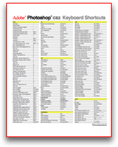
Move faster in Photoshop using keyboard shortcuts. Download this handy PDF cheatsheet, print it out and keep it near your computer (you can choose between a Mac or Windows version):

Source: Created by Trevor Morris.

Open Type Fonts

0 comments
OpenType® is a new cross-platform font file format developed jointly by Adobe and Microsoft. Adobe has converted the entire Adobe Type Library into this format and now offers thousands of OpenType fonts.

The two main benefits of the OpenType format are its cross-platform compatibility (the same font file works on Macintosh and Windows computers), and its ability to support widely expanded character sets and layout features, which provide richer linguistic support and advanced typographic control.

One cross-platform font file

Any OpenType font uses a single font file for all of its outline, metric, and bitmap data, making file management simpler. In addition, the same font file works on Macintosh and Windows computers. As a result, OpenType lets you move font files back and forth between platforms with noticeable improvement in cross-platform portability for any documents that use type.

Source: Adobe Fonts
Related Posts Plugin for WordPress, Blogger...