Choosing Paper for Mailers and PR

Wednesday, February 20, 2008 0 comments
Adapted from Choosing and Using Paper for Great Graphic Design (RotoVision)

By Keith Stephenson and Mark Hampshire

Dateline: February 8, 2008
Read more Graphic Design articles


JHI
Project: Differentia
Designer: JHI
Client: Self-initiated

Paper Facts:
STOCK WAUSAU PAPERS, EXACT OPAQUE, NATURAL TEXT, 50lb
Size 34 1/2 x 23in (876 x 584mm) FLAT
Print Techniques four-COLOR offset litho, two PMS, AND INLINE SPOT-GLOSS VARNISH; ALL four-COLOR IMAGES MANIPULATED TO ALLOW MINIMAL DOT GAIN ON THE UNCOATED SHEET; LINE SCREEN 200dpi
Additional Techniques VARYING FOLDS: SOME copies folded JUST ONCE on the longest axis, THEN COLLATED three SHEETS TOGETHER; others, once COLLATED, were REFOLDED VIA A SECOND PASS ON THE FOLDER TO 11 x 17in (279 x 432mm); SOME WERE then FOLDED 8 1/2 x 11in (273 x 216mm) FOR MAILING
Printer CENVEO

JHI is a strategic creative-services company based in Richmond, Virginia, and Differentia was created as a new business tool, targeting like-minded clients who would connect with it on an emotional level. The piece celebrates uniqueness by focusing on how someone’s key ring holds information about his or her day-to-day life. Its oversized design is enhanced by the stock chosen, which offers just enough intended showthrough to add a subtle extra layer of design value.

The paper’s weight and dimensions also offer the piece greater flexibility. Folded as a newspaper, it becomes a guerrilla-marketing tool, dropped in building lobbies, waiting rooms, bookstores, and restaurants. Folded to envelope size, the recipient can open it as a conventional piece of direct mail.

Differentia was a huge success for JHI, winning numerous design awards, and it was included in a traveling show sponsored by the New York Art Director’s Club.

Read More Graphics.com

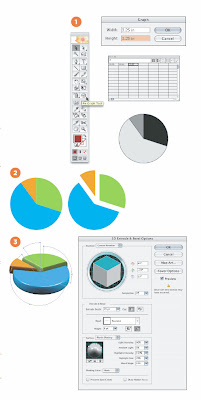
How'd They Do That?: Create 3D Graphs in Illustrator

Monday, February 18, 2008 0 comments
Give your presentation a boost by creating these interesting visuals.

September 2007
Going 3D
Illustrator’s graph tools are very useful for displaying hard data. However, the default colors and graphic options lack flair. Using the following tips, you can turn a boring, flat graphic into a dynamic 3D interpretation.


Read More: Dynamic Graphics

8 Highly Effective Habits for Web Design

0 comments
Take your site from so-so to sublime with these dos and don'ts for the web.

by A.J. Kandy
February 2008

1. DON’T: Talk about yourself so much.
DO: Listen to your users. What are they telling you?
How many websites load the home page with meaningless puffery like “We are the pre-eminent provider of widget technology in the global widget marketplace,” and then provide no clue what to do afterwards?

The key lesson here is: The site is not about you, nor is it to impress your investors or board of directors. It’s for your visitors’ needs and to serve a particular business function—to sell, to inform, to connect, to encourage action. Those should be the bottom-line metrics for the site’s design and functionality choices.

Visitors come to your site looking to see what you can do for them. Think like the users; try to predict what they want to see. To a great extent, users want to see themselves reflected in the design; ideally, you should be providing what they want before they even know they want it. Help users to self-select what type of customer they are, what kind of product they’re looking for or the type of decisions they want to make.

Conduct research, surveys and focus groups. Use web statistics packages and clickstream tracking to see where people go, and determine if the findings measure up to your goals. Are those clicks translating into sales or other measurable actions? If not, refine the design accordingly.

Read More: Dynamic Graphics

How to get images out of Microsoft Word

Tuesday, February 5, 2008 0 comments

One of the greatest problems of our time is undoubtedly Microsoft Word. More specifically, pictures embedded into Microsoft Word documents. I’ll show you several ways to get them out of there. In their original resolution.

Source: Peter's Photoshop Blog

Making Distressed Type with Live Trace

0 comments
Created distressed type or grunge type using the Live Trace tool and a few techniques.


Source: Illustrator Techniques
Related Posts Plugin for WordPress, Blogger...