Illustrator offers a few ‘default’ options for outlines. You get your simple, mechanical-styled strokes in whatever point size you choose. You also get nifty strokes that look like paint, or chalk; oooh, aah! Unfortunately, many designers have seen these default stroke effects used, over and over again. To stand out from the crowd you’ll need to take things to the next level.
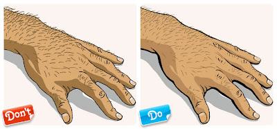
We’ll admit, Example 1 isn’t a bad illustration at all. The proportions are good, the details are relatively clean and there’s some nice color happening. But it could have been a heck of a lot more interesting! You’ll notice all of the lines, while cleanly executed, are the plain ol’ boring 1 point default stroke ending in your typical, bland rounded ends. Every line in the file is the exact same weight. While using default stroke weights can work very nicely on subjects like diagrams and mechanical drawings, it’s not working so well on this hand. Even on mechanical and technical drawings you should still be customizing your stroke weights, or using several different weights to help differentiate between specific sections within the drawing. The line work here lacks both style and personality.
Example 2 is far more exciting. We’ve used what’s called ‘variable’ line weights, meaning the strokes travel from thick to thin. Variable lines are much more natural looking: Even though real-life objects don’t have outlines around them, if they did, we bet they’d be variable and not a consistent 1 point black stroke. Variable lines can be created by outlining your strokes and then playing around with the edges; you can create your own brushes to do the work for you. Working with variable lines can be daunting at first but it’ll elevate your illustrations from amateur to pro.

click here for Full Article.


0 comments:
Post a Comment