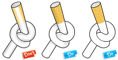
We see this time and time again: new vector illustrators who are smitten with gradient effects. We’ve never been able to figure out why this is (though we’ll all admit, under pressure, that we were the same way when we first started illustrating).
Gradients can add instant depth and volume to a shape with the click of a button and make surfaces gleam. However, it takes a good understanding of how light works to turn a gradient into the powerful tool it can be in the right hands.
Example 1 is a simple file, which would work very well as line art or with some simple shading. But wait: let’s try to make it look nice and rounded with some neat-o gradients! Ouch. Wrong. The gradients here are way too harsh. Creating a gradient that transitions from a solid color all the way to white or black usually ends up looking pretty nasty. That cigarette filter looks horrible with that amount of contrast between the opposite ends of the gradient… After all, filters are made of colored paper, not chrome! The gradients are better on the white part of the cigarette because the contrast isn't as dramatic, but still they really aren't suited to the style of this illustration with its thick heavy outline. Besides, the surgeon general says smoking's bad for you.
We've kept the outlines the same in Examples 2 and 3, all we've changed is the interior coloring technique. The example on the far right is simple flat color, which is clean, bold and simple. The middle example uses a little shading to show a bit of depth, but it's nice and subtle and doesn't interfere with the style of the illustration. I'm still not saying you should light up but this cigarette would clearly be much easier on the eyes/lungs.
 click here for Full Article.


0 comments:
Post a Comment